Google Sign-In panel
A close look at the global Sign-In experience from Google
Let’s kick things off with one the most optimized, tested, and efficient Sign-In patterns out there: Google’s.
If you're in Google's ecosystem, chances are you don't see this panel too often. It may be helpful to take a close look at this panel that's so efficient, it feels invisible.
A default, empty state
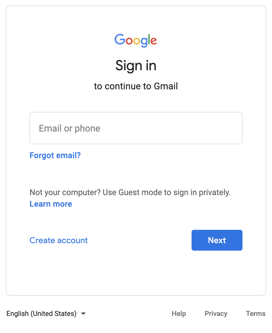
Simple, minimal, balanced; Google’s sign-in form is all of them at once.
Don't let its simplicity fool you, this level of minimalism is focused on effectiveness, and I can just image the amount of effort in research to arrive at this polished solution.
Let’s take a closer look at what’s happening on such a clean panel.
The base model
Simple as it looks, this is the base layout used on all panels in the Sign In, Forgot Password, and Create Account steps. Everything is contained within this frame, and the frame adapts to its contents.
The persistent options on the bottom make it a very effective pattern; they let you select your language and jump to the Help and Privacy sections at any time in the flow.
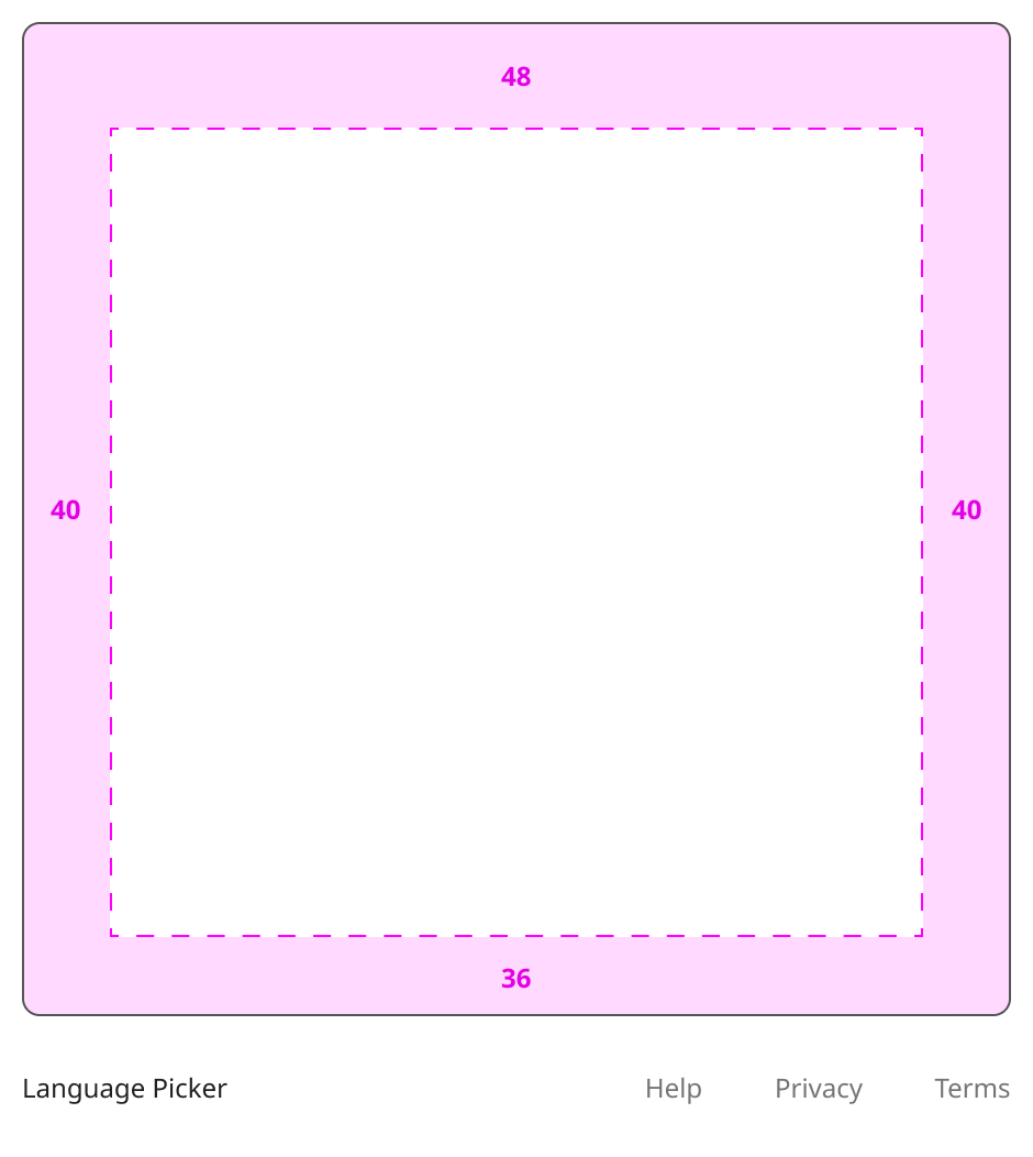
These padding values were inspected directly from the main CSS class. It is worth pointing out how the padding values are not just the same for all sides:
- The horizontal axis has the same padding values so that the content is centered.
- However, the vertical axis seems to account for elements in the content (like the brand logo and headline) and adds a bit of whitespace to the top, so that the content feels centered (aka visually aligned).
In some steps though, the content does show additional whitespace at the bottom (see image on the left) because the panel has a CSS rule of min-height: 500px. The default Sign In panel is an example of this.
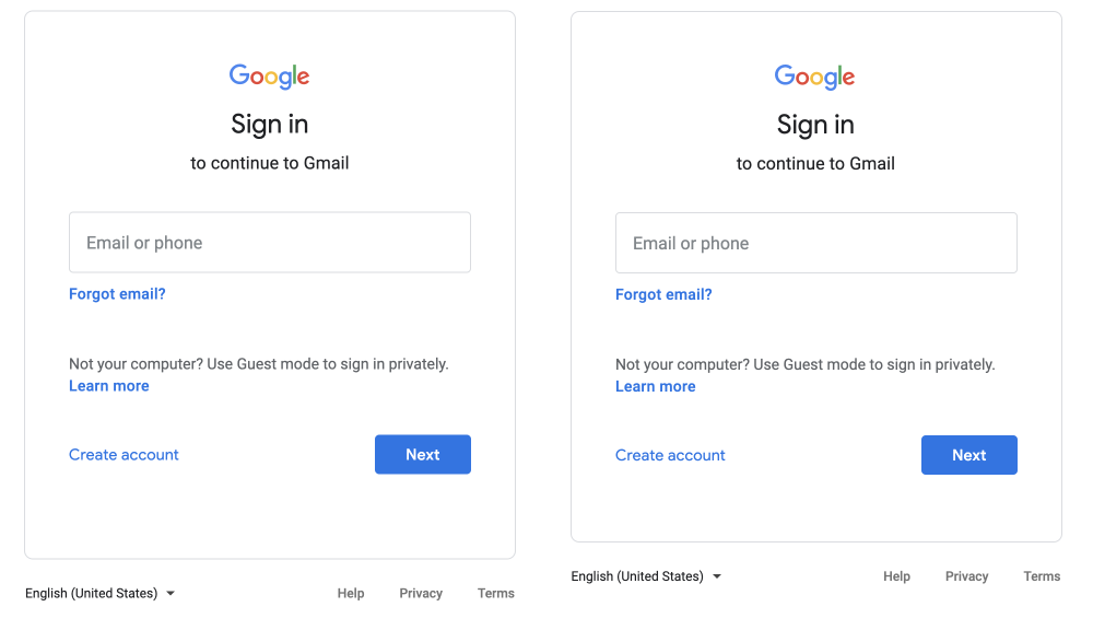
The advantage of using a min-height rule, in this case, is that you can keep a consistent presentation between panels with varying content height.
For example, say we have a flow with 3 steps, and the panel on each step has a different height. When the user moves back and forth across these 3 steps, the panels’ height would be “jumping” up and down.
Instead, using a min-height rule avoids this jarring effect from happening, or at least it helps to reduce it greatly.
Interface and copy
Here’s an abstraction of the core function of each element on the interface.
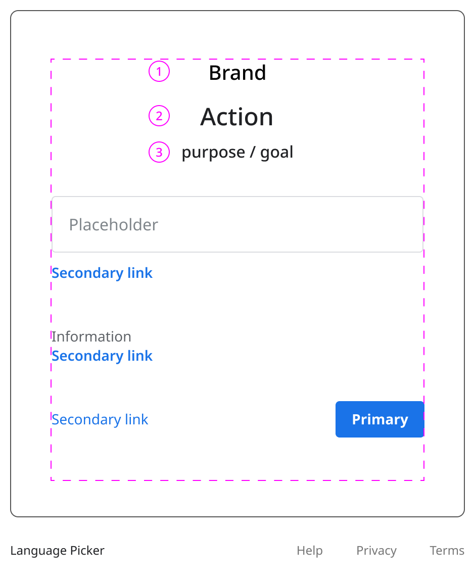
Across all steps in the Sign In and Create Account flows, we see at the top:
- The Logo.
- Description of the requested action (“Sign In” / “Create Account“).
- Description of the objective (“to continue to Gmail“).
A tiny detail worth mentioning: This is barely noticeable, but there’s an inconsistency between the font families being used on the “Secondary links“.
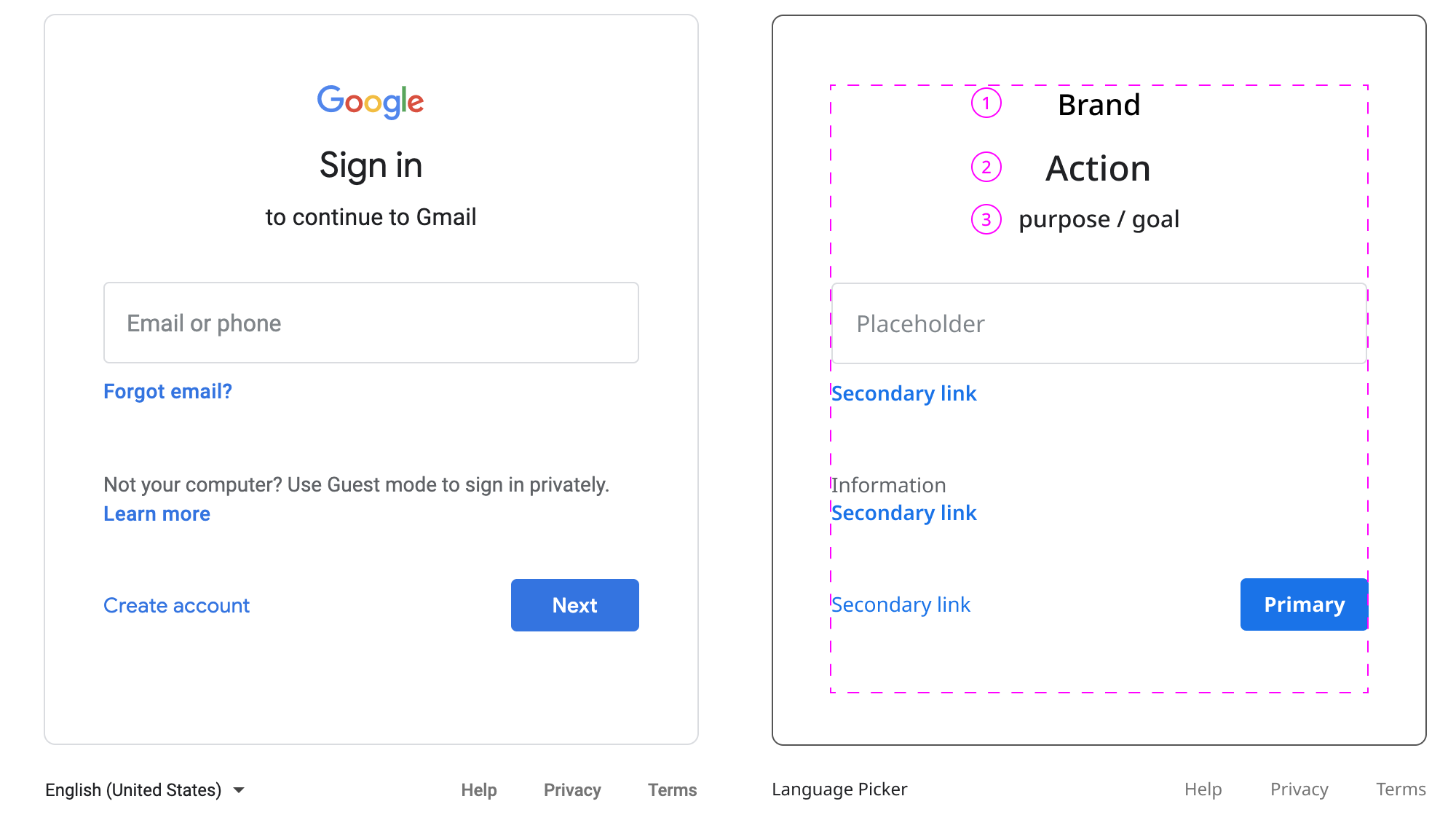
The two at the top (Forgot email?, Learn more) use Roboto, and the one at the bottom (Create account) is using Google Sans. For some reason, Google is using its proprietary brand font for the Create account link.