DoorDash – Add Payment Method
1. One input field to rule them all
Notice the empty state of what it seems to be one input field.
It is in reality four different input fields combined into one:
- Credit card number.
- Expiration date.
- Card verification code.
- Zip code.
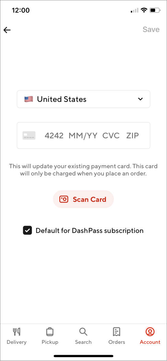
2. Credit Card number pattern, placeholder
When you focus on the input field, it adapts to show the pattern structure of the Credit Card number, with a nice callout to The Hitchhiker's Guide to the Galaxy.
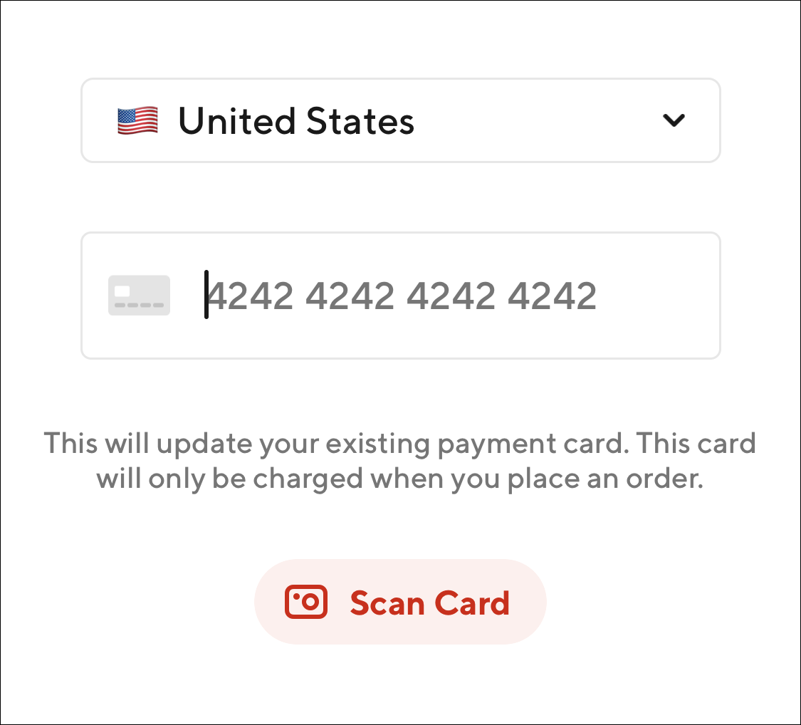
3. Credit card issuer detection
As soon as you enter the first numbers of your card, the system autodetects the card issuer and changes the placeholder icon to show their brand.
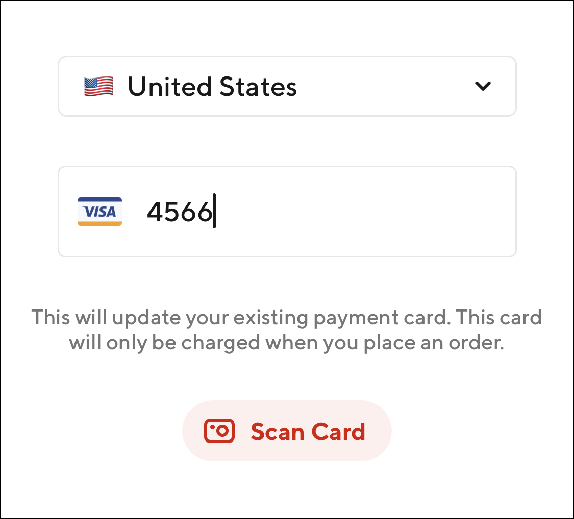
4. Dynamic input fields
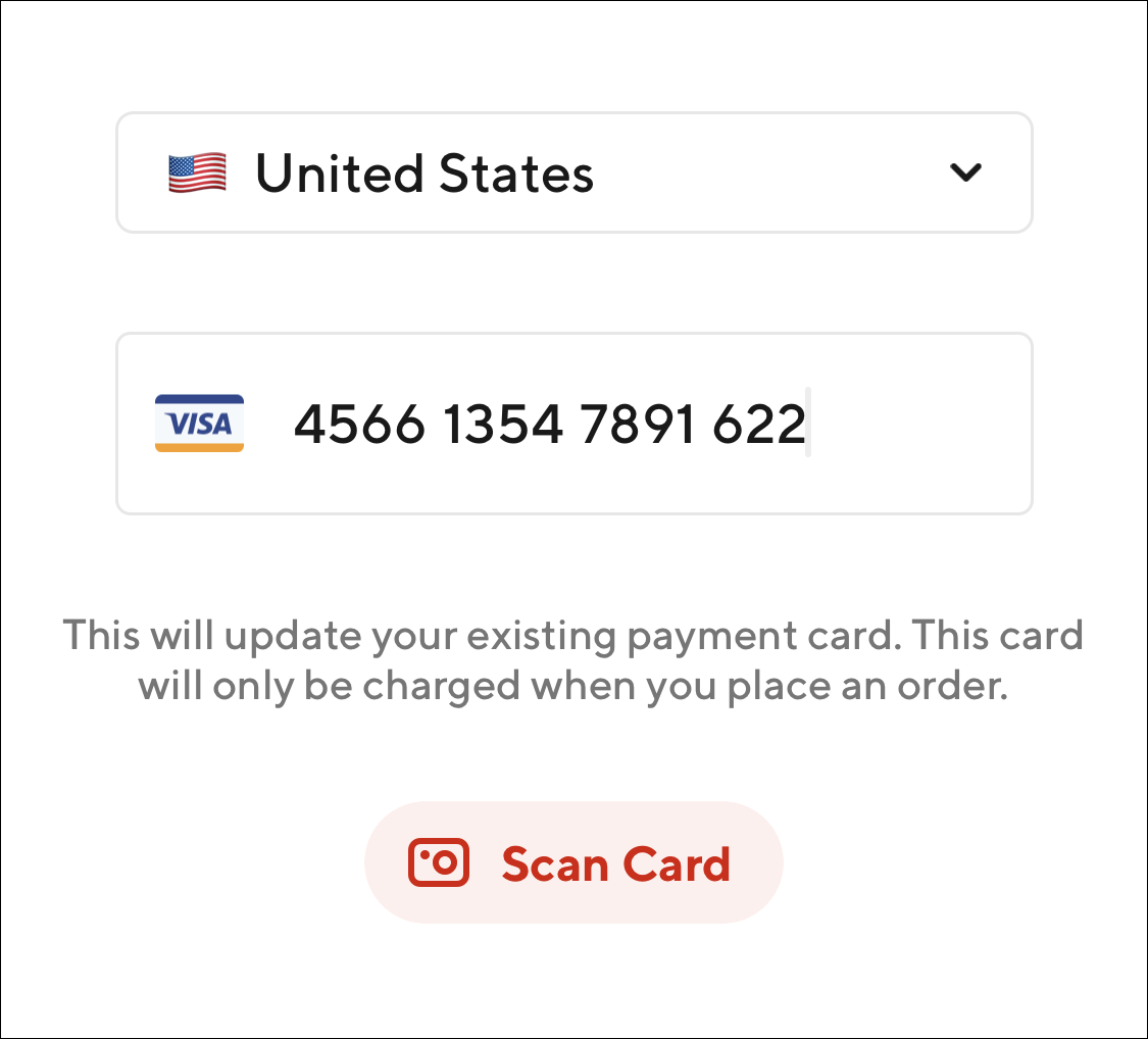
Right after entering the last number of your credit card, the component automatically brings back the other sections.
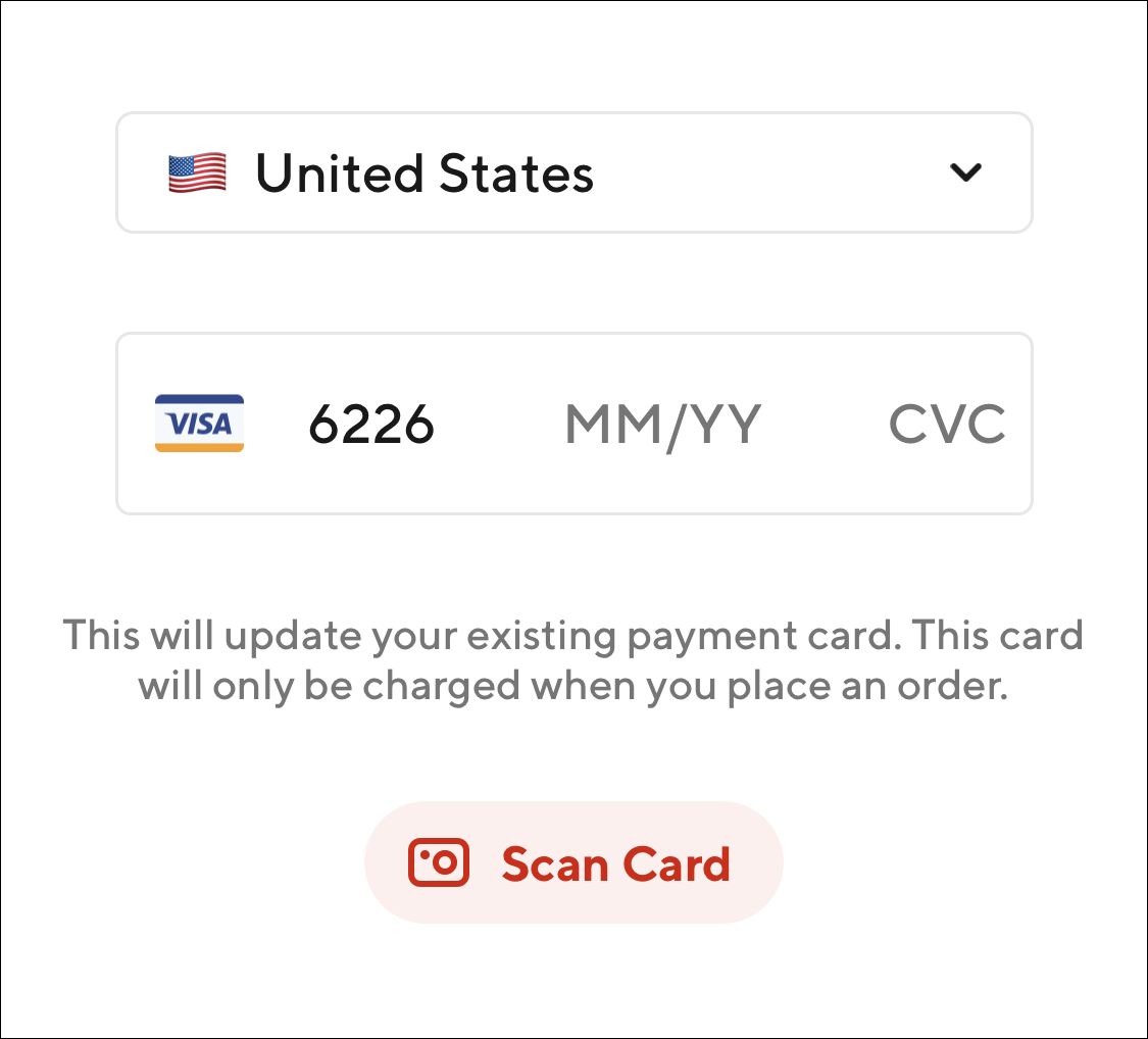
5. Expiration date CVC
Right after entering the expiration date, the placeholder icon on the left flips to show an illustration of the back of a card, indicating where to find the card verification code.
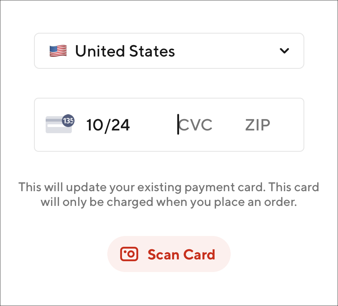
6. Zip code
After entering your CVC, the icon on the left flips back to show the card issuer logo. (See point 8 of this list for a motion reference of this micro-interaction).
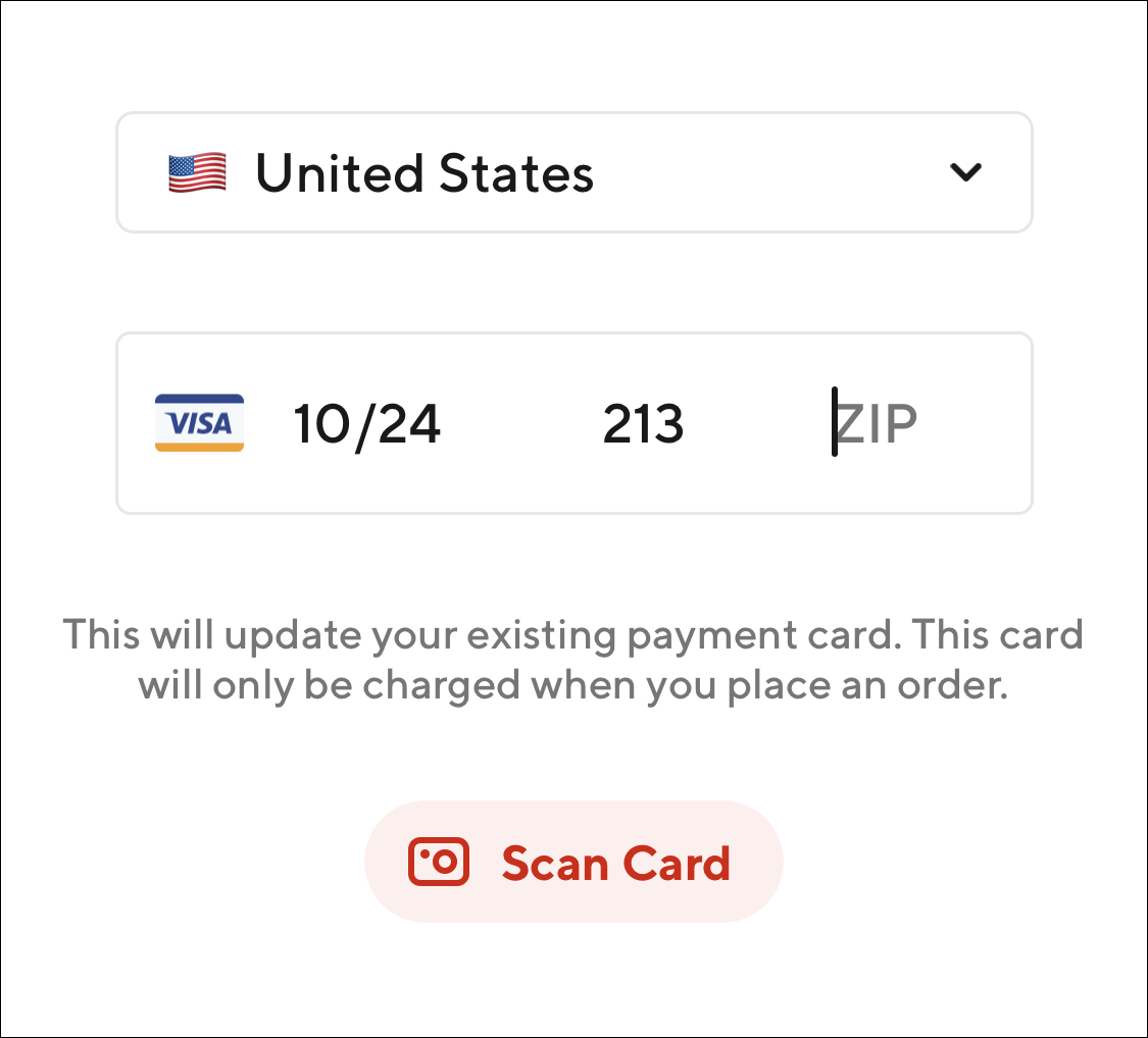
7. All info entered
Entering all the required information kind of goes back to the placeholder pattern shown in the empty state. The one delta is the last 4 numbers on your credit card are no longer showing for some reason. This may be a bug. If you need to change it you need to “go back” by tapping on the other nested input fields, which is not that intuitive.
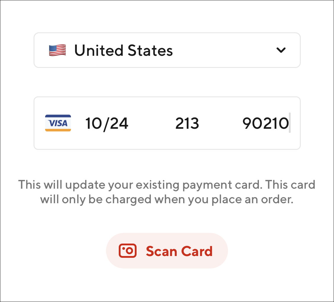
8. Card icon flip animation

